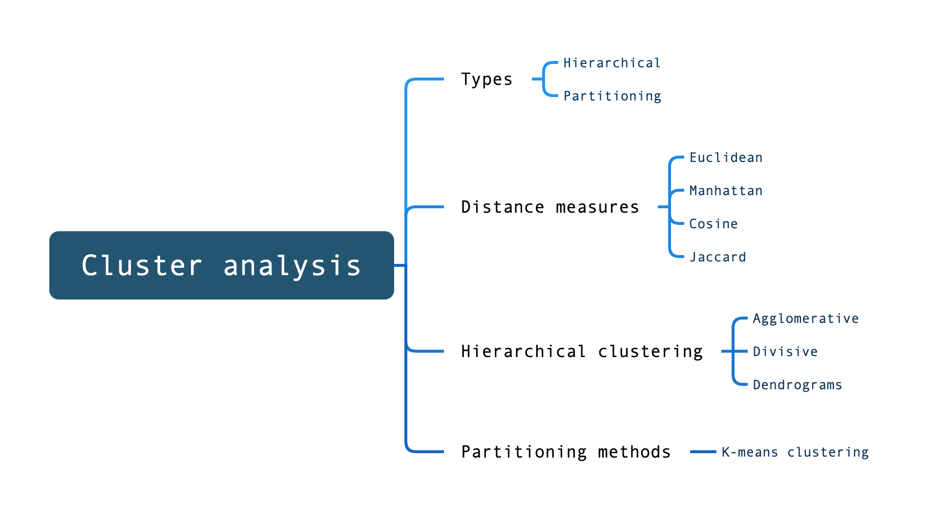
Previously, we covered two main forms of cluster analysis (hierarchical and partitioning) and established a basic understanding of why cluster analysis can be such a useful technique for understanding and interpreting our data.
In this practical we will get some hands-on experience of running these two forms of cluster analysis in R.
20.2 Hierarchical clustering: demonstration
Step One: Loading the data
In this walk-through, we will use the dataset available for download using the following code:
Show code
df <-read.csv('https://www.dropbox.com/scl/fi/4ka6a7tbz03tdfnu5fb2f/cluster_data_01.csv?rlkey=i5gi1k9ydgxdit65ck98ak3tp&dl=1')head(df,10) # display the first six rows
       X            AceRate         DoubleFaultsRate    WinRate
 Min.   : 1.00   Min.   :-0.01421   Min.   :1.345    Min.   :42.10
 1st Qu.:23.25   1st Qu.: 2.37744   1st Qu.:2.062    1st Qu.:62.96
 Median :45.50   Median : 3.32134   Median :3.848    Median :72.42
 Mean   :45.50   Mean   : 4.37620   Mean   :3.692    Mean   :70.04
 3rd Qu.:67.75   3rd Qu.: 6.60527   3rd Qu.:4.952    3rd Qu.:78.08
 Max.   :90.00   Max.   :11.57383   Max.   :7.169    Max.   :90.50
 FirstServeAccuracy BreakPointsSavedRate
 Min.   :56.66      Min.   :39.47
 1st Qu.:66.34      1st Qu.:61.47
 Median :74.46      Median :72.26
 Mean   :72.81      Mean   :70.23
 3rd Qu.:78.82      3rd Qu.:79.08
 Max.   :86.88      Max.   :91.99
Show code
str(df)
'data.frame':   90 obs. of  6 variables:
 $ X                   : int  53 24 68 67 11 74 5 32 86 85 ...
 $ AceRate             : num  2.9659 6.5422 2.212 -0.0142 10.4482 ...
 $ DoubleFaultsRate    : num  1.87 6.37 3.8 2.64 4.31 ...
 $ WinRate             : num  81.1 76.4 50.5 63.8 65.1 ...
 $ FirstServeAccuracy  : num  80.1 64.7 79.2 71.1 61.4 ...
 $ BreakPointsSavedRate: num  78 44.9 80.1 92 74.4 ...
This dataset contains 90 observations, each representing a tennis player. For each player, we have the following information:
AceRate: Average number of aces per match.
DoubleFaultsRate: Average number of double faults per match.
WinRate: Win rate in percentages.
FirstServeAccuracy: First serve accuracy in percentages.
BreakPointsSavedRate: Rate of break points saved in percentages.
Step Two: Computing the distance matrix
As noted previously, hierarchical clustering requires us to calculate a distance matrix.
There are a number of different measures of distance that can be used (Euclidean, Manhattan etc.).
In this walk-through, we’ll use Euclidean distance.
Show code
# calculate a distance matrix using Euclidean distancedist_matrix <-dist(df, method ="euclidean")
What’s Euclidean distance?
Euclidean distance is used to measure the straight-line distance between two points in Euclidean space, which is the familiar two-dimensional or three-dimensional space we encounter in everyday geometry.
It’s calculated using the Pythagorean theorem, which involves squaring the differences between corresponding coordinates of the points and then taking the square root of the sum of these squares.
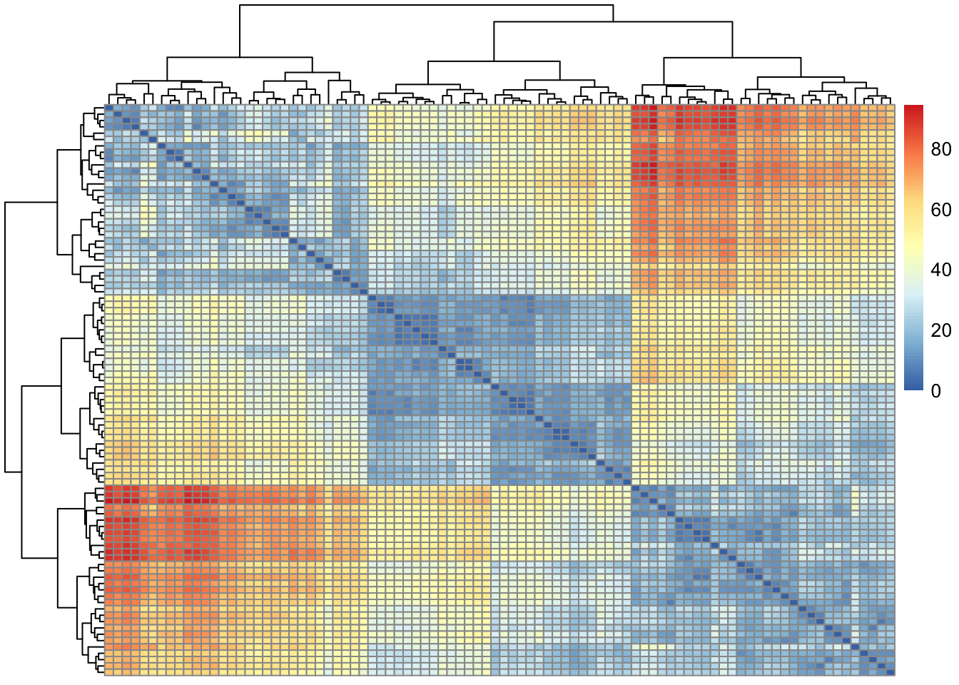
Step Three: Visualise the distance matrix
It’s useful to visualise the distance matrix before continuing to further analysis.
Show code
# using the pheatmap packagelibrary(pheatmap)pheatmap(dist_matrix)
Show code
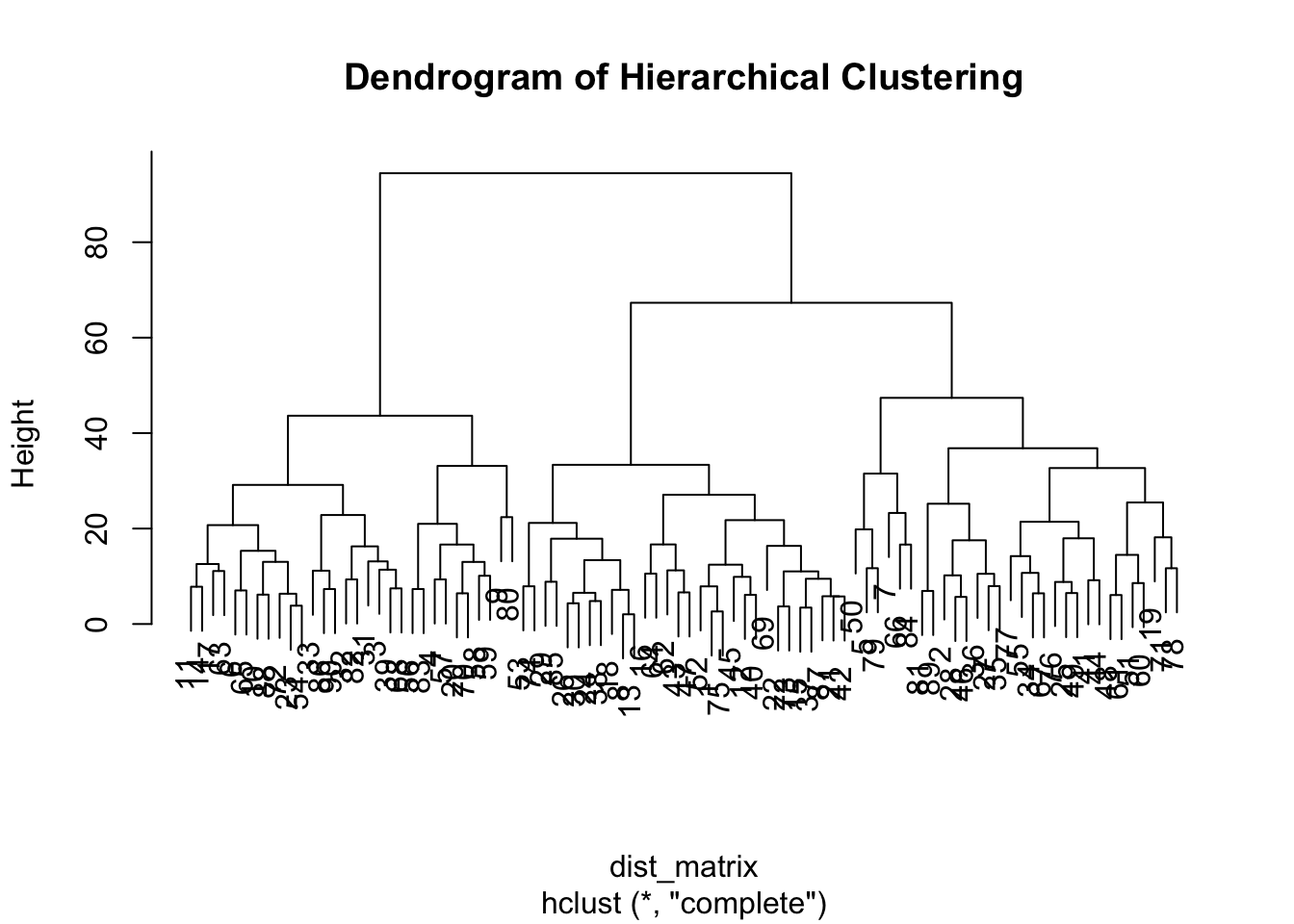
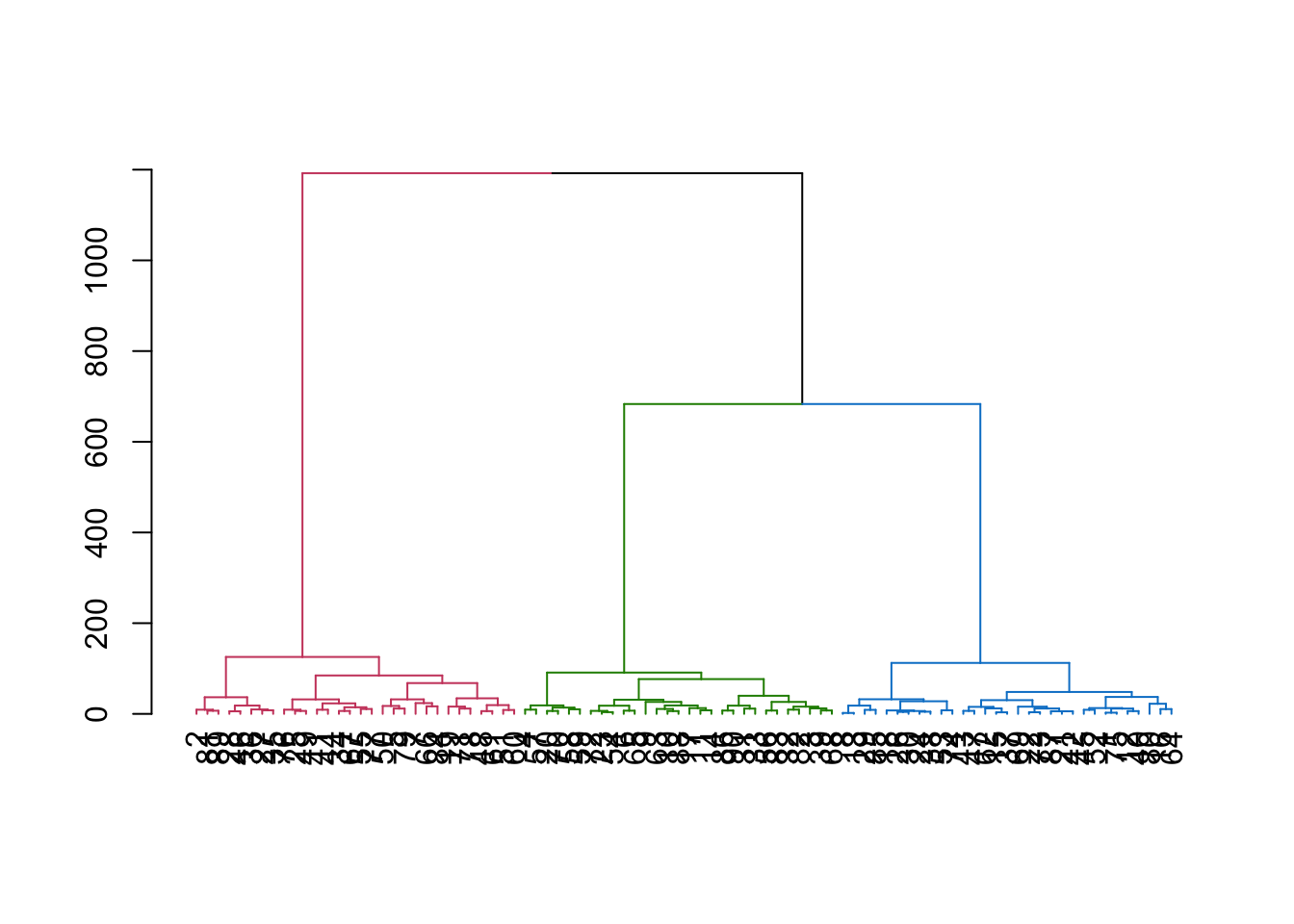
# Hierarchical clusteringhc <-hclust(dist_matrix) # performs a basic hierarchical clustering# Plotting the dendrogramplot(hc, main="Dendrogram of Hierarchical Clustering")
From the dendrogram, it looks like our data might form three clusters. We can check that further in the next stage.
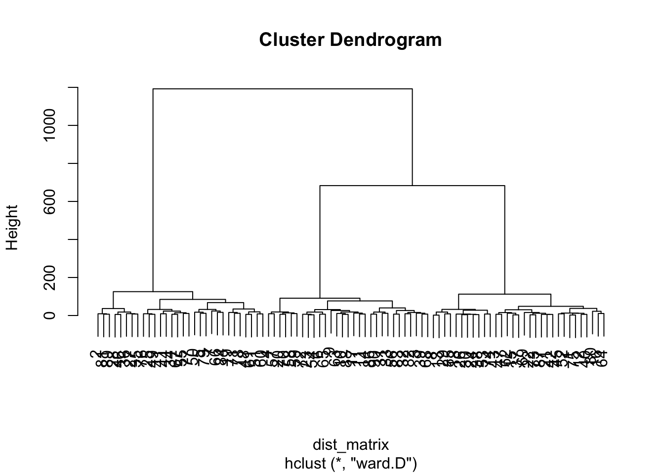
Step Four: Running a hierarchical cluster analysis
We can now use the distance matrix to perform the clustering. There are different methods available to do this; in this walk-through, we’ll use ward.D.
Show code
hc <-hclust(dist_matrix, method ="ward.D")# hc is now in our environment
Step Five: Cut the tree to form clusters
We can now determine the number of clusters, and ‘cut’ the dendrogram.
There’s a section below on how we can determine the best number of clusters to ‘cut’.
For enhanced visualisation, you can use the dendextend package.
Show code
library(dendextend)
---------------------
Welcome to dendextend version 1.17.1
Type citation('dendextend') for how to cite the package.

Type browseVignettes(package = 'dendextend') for the package vignette.
The github page is: https://github.com/talgalili/dendextend/

Suggestions and bug-reports can be submitted at: https://github.com/talgalili/dendextend/issues
You may ask questions at stackoverflow, use the r and dendextend tags:
     https://stackoverflow.com/questions/tagged/dendextend

    To suppress this message use:  suppressPackageStartupMessages(library(dendextend))
---------------------
Attaching package: 'dendextend'
The following object is masked from 'package:stats':

    cutree
Show code
dend <-as.dendrogram(hc)dend <-color_branches(dend, k =3)plot(dend)
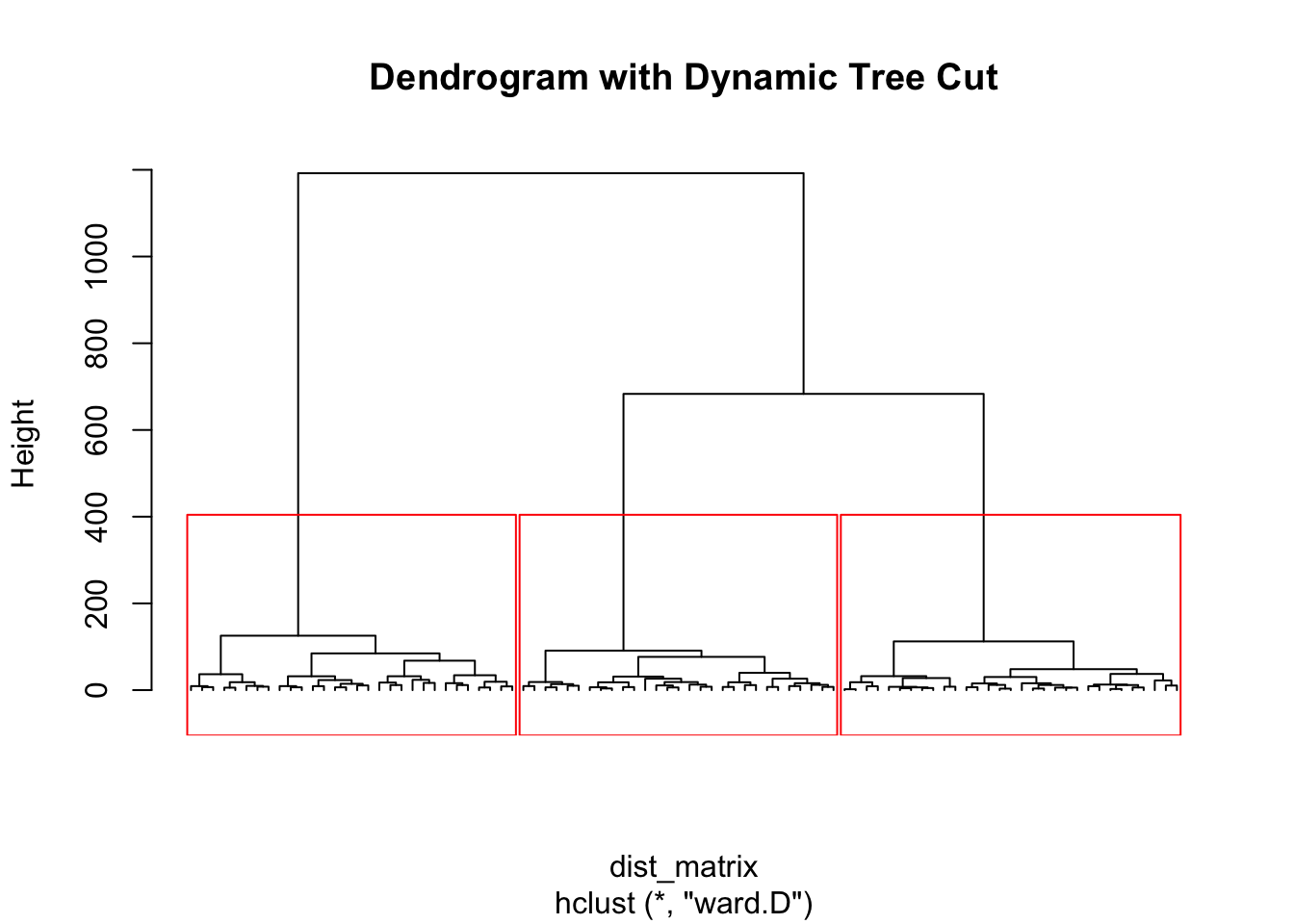
The dynamicTreeCut package is also useful:
Show code
# load the dynamicTreeCut packagelibrary(dynamicTreeCut)# Cut the dendrogram treeclusters <-cutreeDynamic(dendro=hc, distM=as.matrix(dist_matrix), method="hybrid")
 ..cutHeight not given, setting it to 1180  ===>  99% of the (truncated) height range in dendro.
 ..done.
Show code
# Plot the dendrogram with color-coded clustersplot(hc, labels=FALSE, hang=-1, main="Dendrogram with Dynamic Tree Cut")rect.hclust(hc, k=length(unique(clusters)), border="red") # Add colored borders
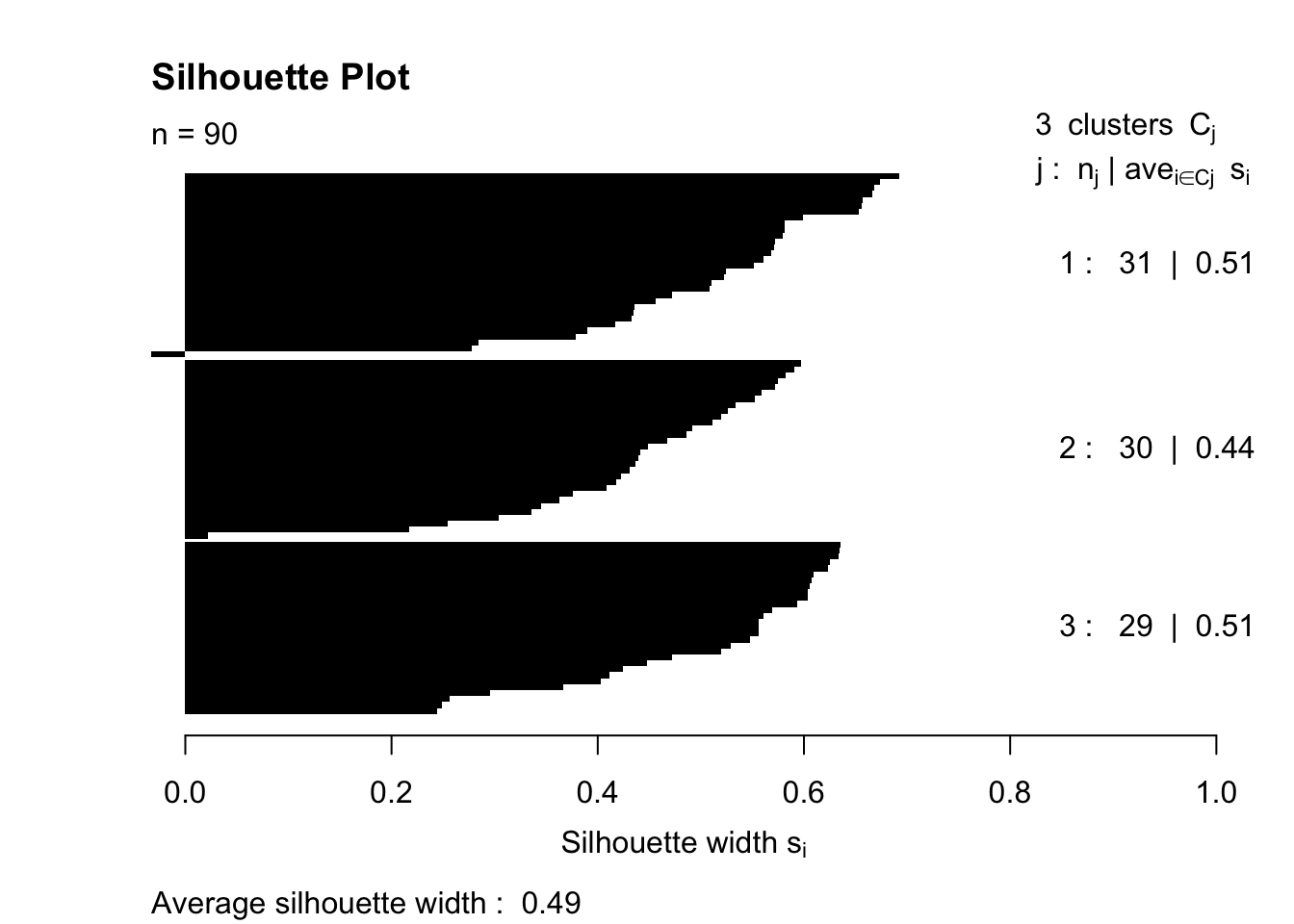
Silhouette plots provide a visual representation of how close each point in one cluster is to points in the neighboring clusters. This helps in assessing the quality of clustering.
Show code
# load the cluster packagelibrary(cluster)# Compute silhouette informationsil <-silhouette(cutree(hc, k=3), dist_matrix)# Plotting the silhouetteplot(sil, col=1:max(sil[,3]), border=NA, main="Silhouette Plot")
Step Seven: Analysing the results
Examine the clusters formed.
You can attach the cluster labels back to your original data for further analysis.
Show code
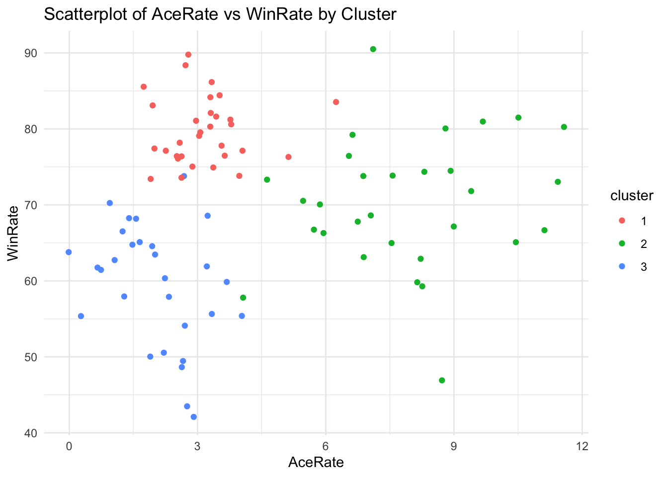
# this command labels each observation depending on which cluster it belongs todf$cluster <-cutree(hc, k =3)
Now, when you view the dataset df, you will see that each player has been ‘attached’ to one of the three clusters.
This information could then be used to perform between-group analysis of difference (e.g. ANOVA) on specific measures.
Or you can use the cluster information to produce plots based on group membership.
Show code
# Example R code for scatterplotdf$cluster <-as.factor(df$cluster) # make sure R knows that cluster is a factor (grouping variable)library(ggplot2)ggplot(df, aes(x = AceRate, y = WinRate, color = cluster)) +geom_point() +labs(title ="Scatterplot of AceRate vs WinRate by Cluster", x ="AceRate", y ="WinRate") +theme_minimal()
There are lots of interesting things you can do with this information. Note this doesn’t work in Quarto, but you should be able to run it on your computer (remove the comment signs).
Depending on your needs, you might perform additional analysis, like:
Checking the characteristics of each cluster.
Conducting statistical tests to understand if clusters differ significantly.
Using principal component analysis (PCA) to reduce dimensions for visualisation.
Determining the number of clusters
You might be wondering ‘why did we choose to identify three clusters’? This is a complex topic and slightly beyond the scope of this practical.
However, some common approaches include:
Dendrogram Analysis. One common method is to visually inspect the dendrogram produced by the hierarchical clustering. Look for the “natural” breaks in the dendrogram where there is a large jump in the distance at which clusters are merged.
Inconsistency Method. This method examines the inconsistencies in the distances at which clusters are merged in the dendrogram. A threshold inconsistency value can be used to decide the number of clusters.
Elbow Method. Although more commonly associated with k-means clustering, the elbow method can also be adapted for hierarchical clustering. It involves plotting the percentage of variance explained as a function of the number of clusters. The point where the marginal gain drops, creating an “elbow” in the graph, indicates the optimal number of clusters. There’s an example below.
Gap Statistic. The gap statistic compares the total within intra-cluster variation for different numbers of clusters with their expected values under null reference distribution of the data. The optimal number of clusters is the value that maximizes the gap statistic.
Silhouette Analysis. This method involves calculating the silhouette coefficient for different numbers of clusters. The silhouette coefficient measures how similar an object is to its own cluster compared to other clusters. The optimal number of clusters usually maximizes the average silhouette score.
Domain Knowledge. Often, the choice of the number of clusters is guided by domain knowledge or the specific requirements of the task at hand. For example, in market segmentation, the number of clusters might be determined based on the number of different marketing strategies the team can feasibly implement.
Stability Analysis. Stability-based methods involve comparing the results of cluster analysis on the original data with those on perturbed or bootstrapped samples. If a particular number of clusters consistently emerges across different samples, it may be considered the optimal number.
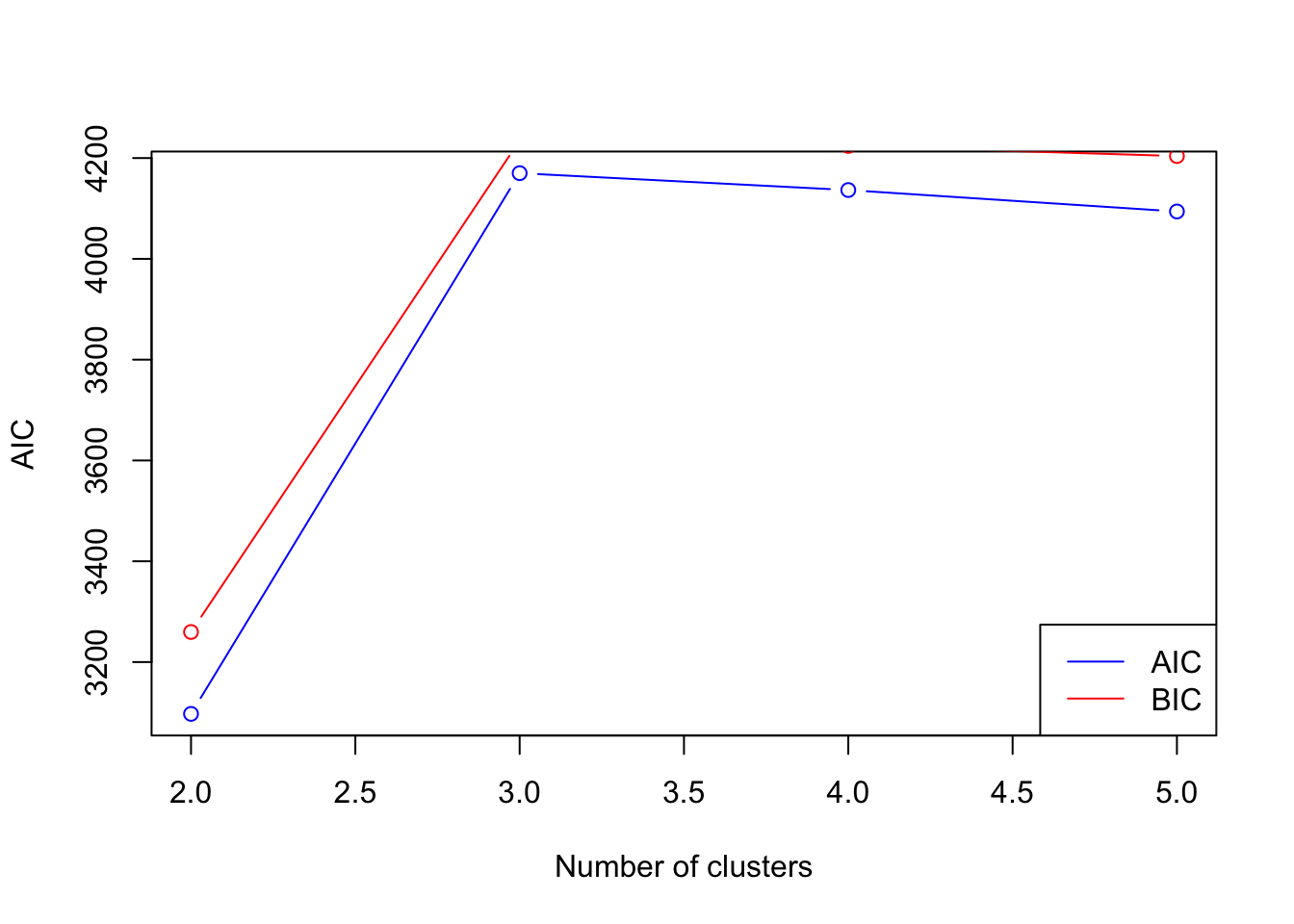
Statistical Criteria. Some statistical criteria like the Akaike Information Criterion (AIC) or the Bayesian Information Criterion (BIC) can be used to compare models with different numbers of clusters. These criteria balance the goodness-of-fit of the model with the complexity of the model.
The final approach, statistical criteria, can be very helpful, as it allows you to compare different models.
There are some mathematical issues with using AIC and BIC in hierarchical models (i.e. no defined likelihood function) which makes them slightly less reliable. They should be used alongside other approaches, such as visual inspection of the dendrogram.
In the following example, I’ve used AIC and BIC to evaluate models from 2 to 5 clusters. In the resulting plot, you’ll see that AIC is highest with 3 clusters, suggesting we were ‘right’ to use this number previously.
Show code
library(mclust)
Package 'mclust' version 6.0.1
Type 'citation("mclust")' for citing this R package in publications.
Show code
library(cluster)# Assuming 'hc' is your hierarchical clustering model# and 'df' is your original dataaic_values <-numeric()bic_values <-numeric()max_k <-5for (k in2:max_k) { # max_k is the maximum number of clusters you want to consider# Cut the dendrogram to get k clusters clusters <-cutree(hc, k)# Fit a Gaussian mixture model (as a proxy) to the data for the given number of clusters gmm <-Mclust(df, G = k)# Store the AIC and BIC values aic_values[k] <-AIC(gmm) bic_values[k] <-BIC(gmm)}# Plot AIC and BIC values to find the optimal number of clustersplot(2:max_k, aic_values[2:max_k], type ="b", col ="blue", xlab ="Number of clusters", ylab ="AIC")points(2:max_k, bic_values[2:max_k], type ="b", col ="red")legend("bottomright", legend =c("AIC", "BIC"), col =c("blue", "red"), lty =1)
20.3 Hierarchical Clustering: Practice
Note
It’s time to put what you’ve learned into practice. There are two parts to this section. The Core Task is designed to replicate the steps outlined above, and give you confidence in undertaking a basic hierarchical cluster analysis of a dataset. The second is intended as an Extension Task, and is optional. This will take you further into the topic, but may require significant further reading.
Core task
Objective: The goal of this task is to familiarize you with the process of conducting a hierarchical cluster analysis using R and to gain confidence in preparing data, performing the analysis, and interpreting the results.
The dataset contains data for 200 golfers, with four attributes (variables): - DrivingAccuracy - PuttingAccuracy - AverageScore - TournamentsWon
Task Steps:
Data Preparation
Import the dataset.
Check the data for missing values and outliers.
Exploratory Data Analysis
Perform basic statistical analyses (mean, median, standard deviation).
Visualise the data using plots (scatter plots, box plots).
Distance Computation
Calculate the distance matrix using an appropriate distance measure (e.g., Euclidean).
Hierarchical Clustering
Perform hierarchical clustering using methods like Ward’s method or single linkage.
Generate a dendrogram to visualise the clustering.
Determining the Number of Clusters
Use methods like dendrogram inspection, statistical approaches like AIC/BIC, the elbow method, or silhouette analysis to determine the optimal number of clusters.
Cluster Analysis
Cut the dendrogram to form the identified number of clusters.
Analyse the characteristics of each cluster.
Interpretation and Reporting
Interpret the results in the context of the data.
Extension task (optional)
Objective:
This extension task aims to deepen your understanding of hierarchical cluster analysis by introducing advanced concepts and applications. You could explore different techniques and compare hierarchical clustering with other clustering methods.
Task Steps:
Advanced Clustering Techniques
Explore different linkage methods (complete, average, centroid) and compare their impact on the clustering results.
Comparative Analysis
Perform k-means clustering on the same dataset.
Compare the results of k-means and hierarchical clustering. Discuss the pros and cons of each method.
Cluster Validation
Implement internal validation measures such as the Dunn index or Davies-Bouldin index to assess the quality of the clusters.
Dimensionality Reduction
Apply Principal Component Analysis (PCA) to reduce the dataset to two or three dimensions.
Perform hierarchical clustering on the reduced dataset and compare the results with the original high-dimensional clustering.
Statistical Analysis and Interpretation
Perform a statistical analysis to understand the significance of the clusters.
Provide a detailed interpretation of the clusters in the context of the complex dataset.
20.4 K-means Clustering: Demonstration
K-means clustering is an unsupervised learning technique used for partitioning a dataset into K distinct, non-overlapping clusters.
The following walk-through provides a step-by-step process for conducting a basic k-means cluster analysis.
Step One: Load packages and data
Along with the stats package that comes as part of base R, we need to load two packages, dplyr and ggplot2.
Show code
library(dplyr)library(ggplot2)
For this walk-through, we’re going to create a dataset called athletes_data by downloading a remote file:
Show code
athletes_data <-read.csv('https://www.dropbox.com/scl/fi/f1czg6gk1mvhwmms5j4gz/k_means_01.csv?rlkey=jc4xak7rkgf67omdpri9ymygu&dl=1')head(athletes_data,10) # display the first six rows
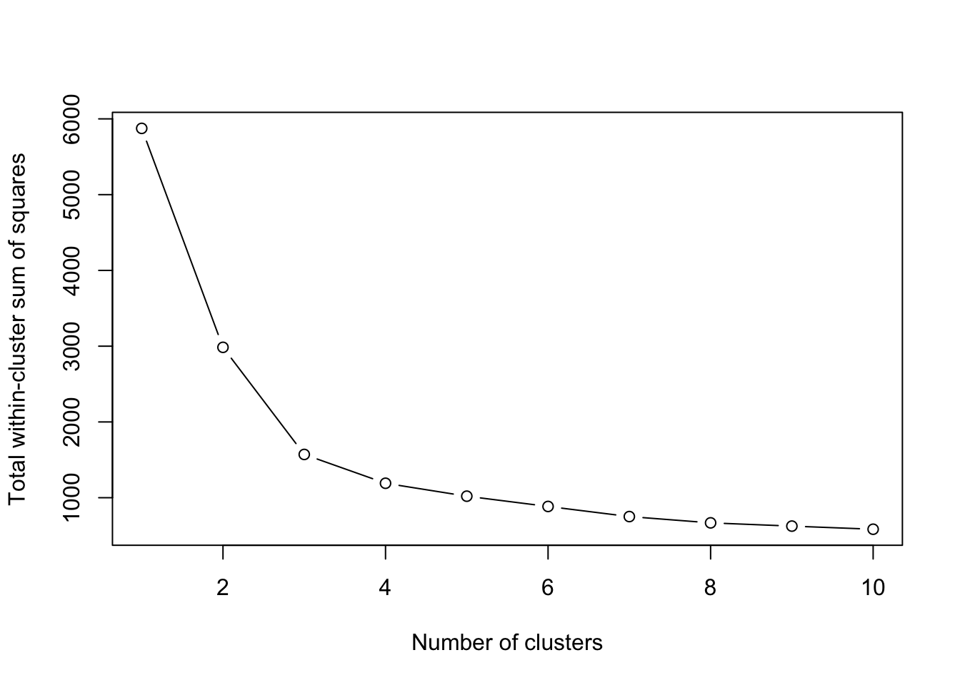
Now, we can use the Elbow Method to determine optimal clusters.
The Elbow method involves running k-means clustering on the dataset for a range of values of k (number of clusters) and then plotting the total within-cluster sum of squares (WSS).
Show code
# Determine max number of clusters you want to testmax_clusters <-10# Calculate total within-cluster sum of squarewss <-sapply(1:max_clusters, function(k){kmeans(clustering_data, centers=k, nstart=10)$tot.withinss})# Plot the Elbow Plotplot(1:max_clusters, wss, type="b", xlab="Number of clusters", ylab="Total within-cluster sum of squares")
To interpret this plot, find the “elbow” point in the plot. This point represents a balance between minimizing WSS and having a smaller number of clusters. It’s the point beyond which the reduction in WSS starts diminishing. In the plot above, this looks to be 4 clusters (the slope becomes much flatter after this).
Choosing the number of clusters often requires a bit of subjective judgment. In some datasets, the elbow might not be very pronounced, and in such cases, alternative methods like the silhouette method can be used.
It’s also important to remember that the Elbow method is heuristic and provides an approximate number of clusters. The actual number might vary depending on the specific context and requirements of the analysis.
Caution
The term “heuristic” refers to a practical approach to problem-solving, learning, or discovery that employs a method not guaranteed to be optimal or perfect, but sufficient for reaching an immediate, short-term goal or approximation.
Heuristics are often used in situations where an exhaustive search or precise solution is impractical or impossible due to time or resource constraints.
Step Four: Run the K-means algorithm
Now, using the determined number of clusters (let’s say 4 for this dataset) we can perform k-means clustering.
Show code
# Select only the relevant columns for clusteringclustering_data <- athletes_data[, c("speed", "endurance", "strength", "agility")]# Perform k-means clustering with 4 clustersset.seed(123) # Set a random seed for reproducibilitykmeans_result <-kmeans(clustering_data, centers =4, nstart =20)# View the resultsprint(kmeans_result)
# Adding cluster assignments to the original datasetathletes_data$cluster <- kmeans_result$cluster# make sure R knows that 'cluster' is a grouping variable, or factorathletes_data$cluster <-as.factor(athletes_data$cluster)# We can view the first few rows to see the cluster assignmentshead(athletes_data)
We use the kmeans function from the stats package. The centers parameter is set to 4, as determined by the Elbow method.
The nstart parameter is set to 20. This means the k-means algorithm will be run 20 times with different random starts. The best solution in terms of within-cluster sum of squares is retained. This helps in achieving a more reliable outcome, as k-means clustering is sensitive to the initial starting points.
set.seed(123) is used for reproducibility. It ensures that the random numbers generated are the same each time the code is run, which is important for replicating the results.
After running the clustering, we add the cluster assignments back to the original dataset. This allows for further analysis and exploration of the clusters.
Finally, the results of the k-means clustering, including the centroids of each cluster and the size of each cluster, are printed out for review.
Step Five: Examine the results
We can inspect the results in several ways. First, look at the cluster centroids.
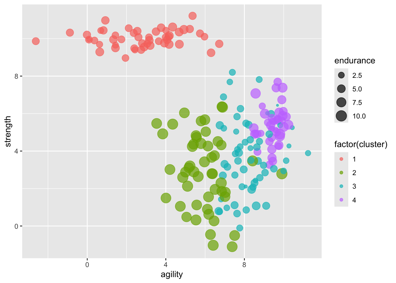
Check the size of each cluster. Note that cluster 1 seems to represent ‘strength’, while cluster 2 represents ‘endurance’.
You’ll notice that each athlete’s most ‘dominant’ cluster is now included in the dataset athletes_data. If we knew more about the athletes, we could now check whether our clusters are ‘accurate’ (for example, do the weightlifters tend to cluster around cluster 1?)
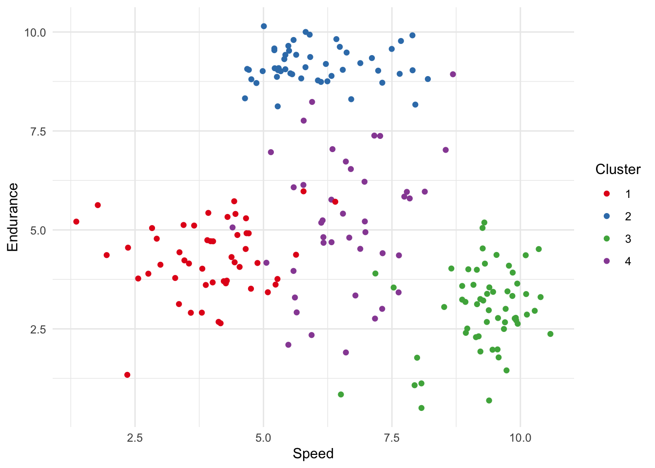
Step Six: Visualise the clusters
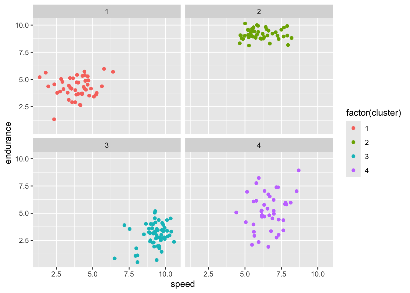
Create a plot to visualize the clusters, using ggplot2 for example. This plot shows speed against endurance for each of the four clusters. Notice that athletes in cluster 1 (red) are lower than the others on both variables.
Show code
# Create a scatter plot using ggplotggplot(athletes_data, aes(x = speed, y = endurance, color =factor(cluster))) +geom_point() +# Add pointslabs(color ="Cluster", x ="Speed", y ="Endurance") +# Labelingtheme_minimal() +# Minimal themescale_color_brewer(palette ="Set1") # Use a color palette for better distinction
Step Seven: Validate our analysis
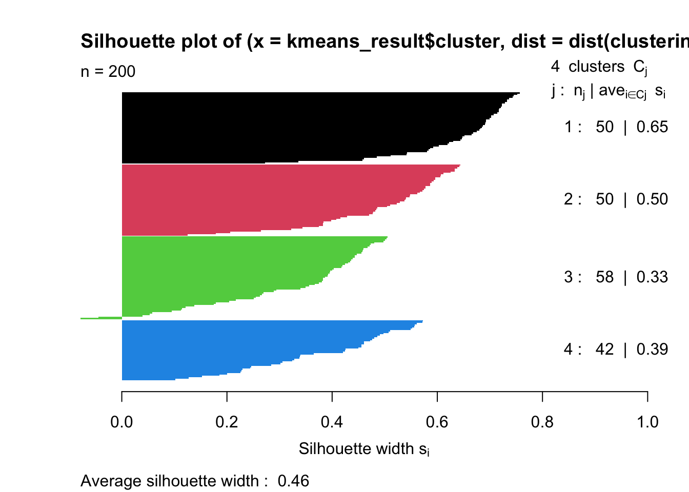
The use of four clusters seems reasonable in the context of our dataset. However, we might want to gain additional reassurance. One approach is to calcuate the **silhouette coefficient’ of our clustering.
The silhouette coefficient is a measure of how similar an object is to its own cluster (cohesion) compared to other clusters (separation).
We need to use the ‘cluster’ package to do this.
Show code
# Load necessary librarieslibrary(cluster) # for silhouettelibrary(stats) # for kmeans# Calculating silhouette widthsil_width <-silhouette(kmeans_result$cluster, dist(clustering_data))# Average silhouette width for the entire datasetavg_sil_width <-mean(sil_width[, 'sil_width'])# Print the average silhouette widthprint(avg_sil_width)
[1] 0.462397
Show code
# Plot the silhouette plotplot(sil_width, col =1:max(kmeans_result$cluster), border =NA)
The silhouette function computes the silhouette widths for each observation in our dataset. It requires two arguments: the clustering vector (from your k-means result) and the distance matrix of the data.
The dist function is used to compute the distance matrix required by silhouette.
avg_sil_width calculates the average silhouette width for all observations, providing an overall measure of the clustering quality.
Finally, a plot is generated to visually inspect the silhouette widths of individual observations. This plot can help identify which observations may be poorly clustered.
A silhouette width close to +1 indicates that the object is well matched to its own cluster and poorly matched to neighboring clusters.
If most objects have a high value, the clustering configuration is appropriate.
If many points have a low or negative value, the clustering configuration may have too many or too few clusters.
Further ideas for visualisation
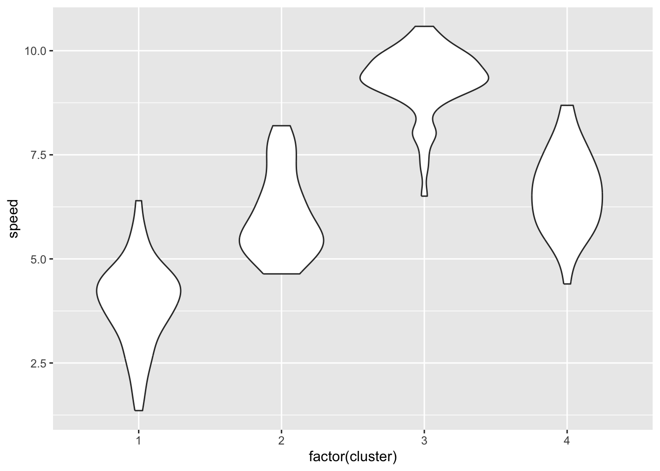
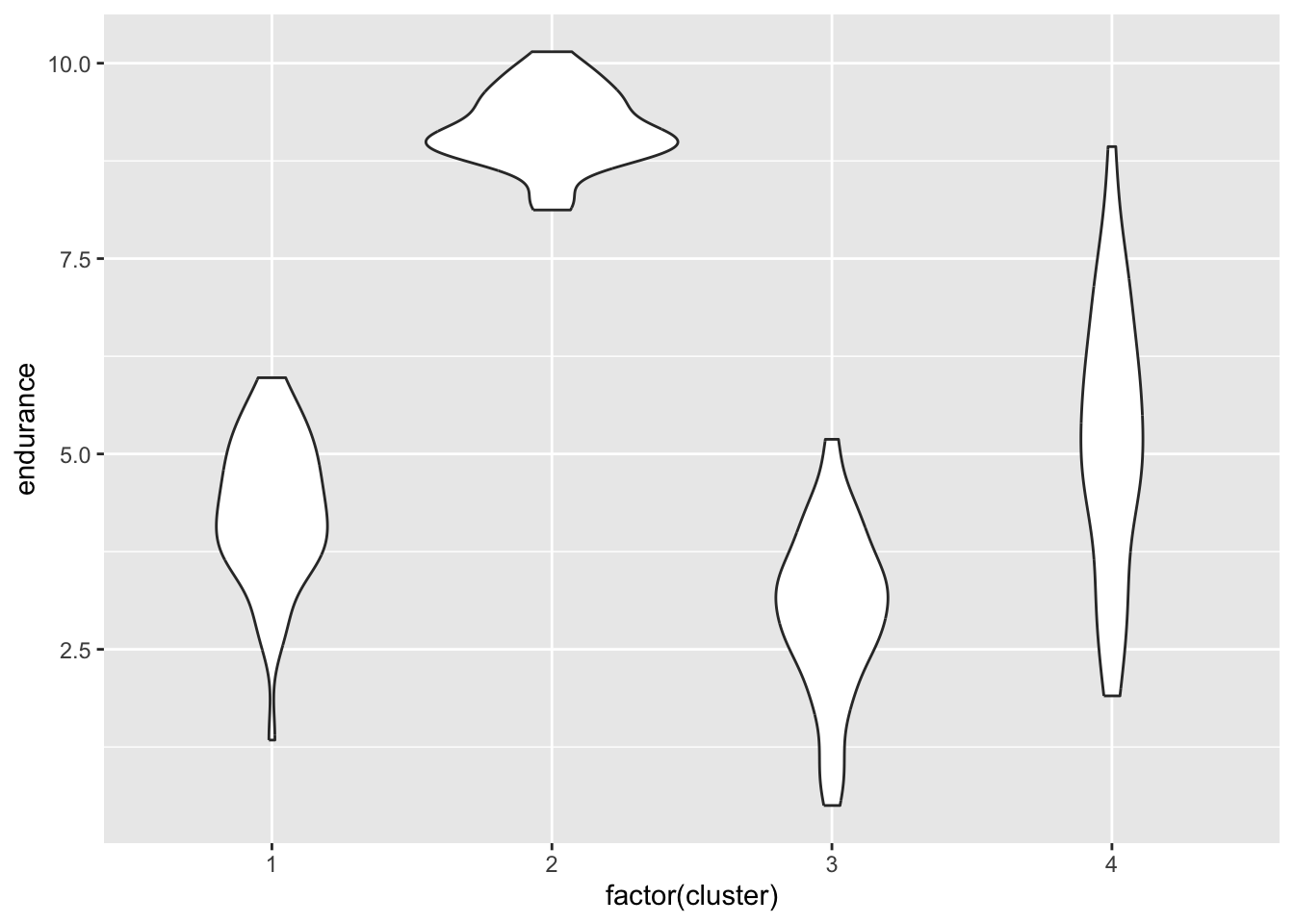
One of the most useful things about cluster analysis is its ability to provide visual representations of data. Here are some examples that you might find useful:
Show code
library(ggplot2)library(RColorBrewer)library(gplots)## ## Attaching package: 'gplots'## The following object is masked from 'package:stats':## ## lowessggplot(athletes_data, aes(speed, endurance, color=factor(cluster))) +geom_point() +facet_wrap(~cluster)
Examine the data. Check for outliers, or missing data. Try to understand the data.
Step Two: Data exploration
Calculate descriptive statistics (mean, median, standard deviation, kurtosis, skewness) for each variable.
Step Three: Identify number of clusters
Choose the number of clusters using the Elbow method to estimate the optimal number of clusters.
Apply any domain-specific knowledge to inform your choice of the number of clusters.
Step Four: Perform k-Means clustering
Perform k-means clustering.
Choose parameters like the number of clusters and the number of iterations.
Add the cluster identifier to each athlete’s data
Step Five: Analyse the results
Examine the centroids of each cluster.
Look at the distribution of data points in each cluster. Use visual approaches to help you.
Interpret the clusters in the context of the problem. This might involve understanding what each cluster represents.
Step Six: Validate the clusters
Use metrics like the silhouette coefficient to measure the quality of clustering.
Step Seven: Report the results
Consider how you would report the results of your analysis.
Show solution for practice
#-----------------------------# Load and Expore the Data#-----------------------------df <-read.csv('https://www.dropbox.com/scl/fi/n0qhuenart33mt33cw1m6/k_means_02.csv?rlkey=2m7dtn3haor99eecosxzxh52s&dl=1')head(df,10) # display the first ten rowssummary(df)str(df)#---------------------------# Step Two: Data exploration#---------------------------library(psych) # just one possible approachdescribe(df)#---------------------------# Step Three: Determine optimal number of clusters#---------------------------clustering_data <- df[, c("endurance", "sprinting_ability", "climbing_ability")]# Determine max number of clusters you want to testmax_clusters <-10# Calculate total within-cluster sum of squarewss <-sapply(1:max_clusters, function(k){kmeans(clustering_data, centers=k, nstart=10)$tot.withinss})# Plot the Elbow Plotplot(1:max_clusters, wss, type="b", xlab="Number of clusters", ylab="Total within-cluster sum of squares")#---------------------------# Step Four: Run the k-means algorithm#---------------------------# Perform k-means clustering with 4 clustersset.seed(123) # Set a random seed for reproducibilitykmeans_result <-kmeans(clustering_data, centers =3, nstart =20)# View the resultsprint(kmeans_result)# Adding cluster assignments to the original datasetdf$cluster <- kmeans_result$cluster# We can view the first few rows to see the cluster assignmentshead(df)#---------------------------# Step Five: Examine results#---------------------------kmeans_result$centers# suggests that cluster one is clustered around sprinting ability, cluster two around climbing ability, and cluster three around endurance# Create a scatter plot using ggplotggplot(df, aes(x = sprinting_ability, y = climbing_ability, color =factor(cluster))) +geom_point() +# Add pointslabs(color ="Cluster", x ="Sprinting", y ="Climbing") +# Labelingtheme_minimal() +# Minimal themescale_color_brewer(palette ="Set1") # Use colour palette for better distinctionggplot(df, aes(x = sprinting_ability, y = endurance, color =factor(cluster))) +geom_point() +# Add pointslabs(color ="Cluster", x ="Sprinting", y ="Endurance") +# Labelingtheme_minimal() +# Minimal themescale_color_brewer(palette ="Set1") # Use colour palette for better distinction#---------------------------# Step Six: Validate clusters#---------------------------# Load librarieslibrary(cluster) # for silhouettelibrary(stats) # for kmeans# Calculating silhouette widthsil_width <-silhouette(kmeans_result$cluster, dist(clustering_data))# Average silhouette width for the entire datasetavg_sil_width <-mean(sil_width[, 'sil_width'])# Print the average silhouette widthprint(avg_sil_width)# Plot the silhouette plotplot(sil_width, col =1:max(kmeans_result$cluster), border =NA)